Switzerland: still a font of creativity
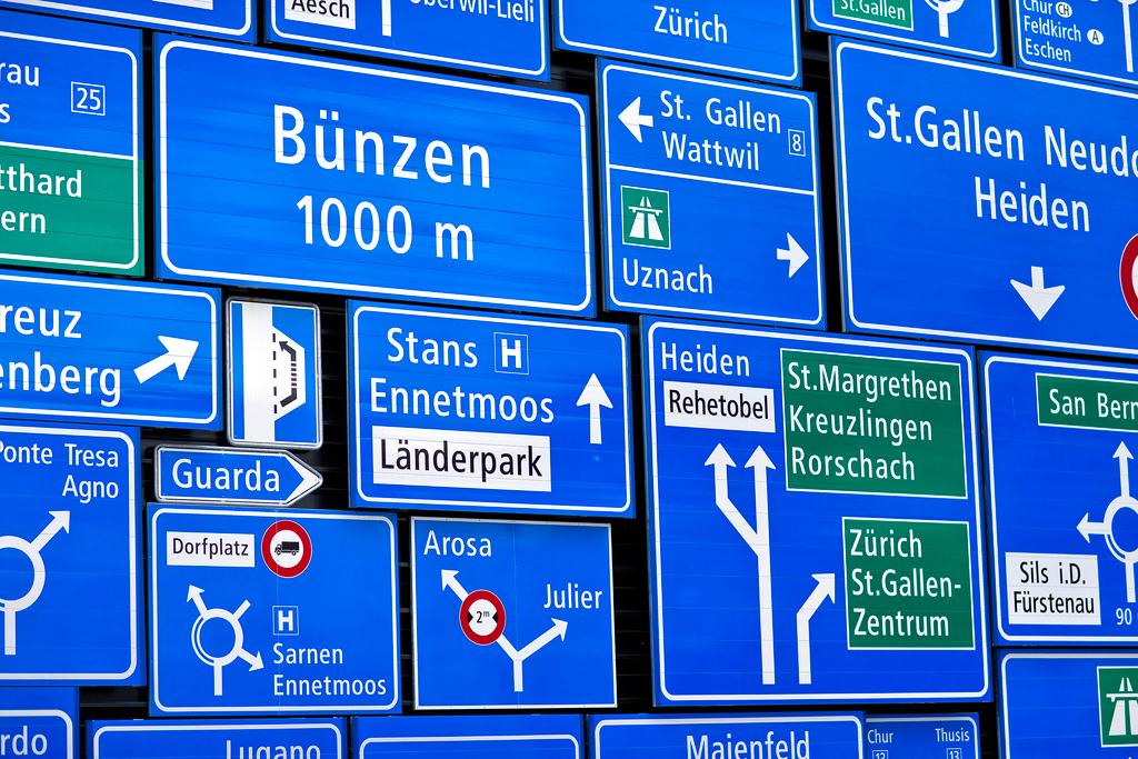
Sixty years ago Switzerland was the centre of the typographic universe, producing globe-conquering typefaces such as Helvetica and Univers. The internet and desktop design has revolutionised the industry, but Swiss art and design remain in demand.
“Words can’t describe my disgust!” “It’s a sad day.” “So predictable, so dull, so corporate.” Not many people care about typefaces and fonts (see the glossary for the difference), but those who do really do.
Those were reactions to the shock news in 2009 that IKEA was changing its typefaceExternal link from Futura, the timeless classicExternal link used by Volkswagen and Calvin Klein and many others, to Verdana, the ubiquitous screen typeface designed for Microsoft.
That “fontroversy” largely bypassed Switzerland, but the birthplace of International Typographic StyleExternal link – as the use of asymmetric layouts, grids and sans-serif typefaces in the 1950s came to be known – has seen its share of backlashes.
“There was a time in the 1980s and 1990s when HelveticaExternal link was out of fashion for avant-garde graphic designers,” Robert Lzicar, graphic design historian and head of the Masters programme in communication design at Bern University of the Arts, told swissinfo.ch.
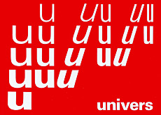
The golden age of Swiss typography started in 1957, when Bauhaus-influenced functional design resulted in the release of Helvetica and UniversExternal link. These stripped-down, clean and readable typefaces caught the zeitgeist and the attention of graphic designers around the world – and particularly in the United States.
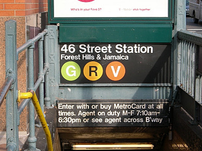
Helvetica, the typeface of choice of Nestlé, Lufthansa, the New York subway, McDonald’s and many, many others, was even the subject of a 2007 documentary.
“Switzerland has certainly been very creative in designing fonts, but there was never a huge typeface industry here,” Lzicar said.
A typeface (also known as font family) is a set of one or more fonts each composed of glyphs (characters) that share common design features. In digital typography, the font is a digital file which contains the typeface; the typeface is what you see.
Each font of a typeface has specific characteristics, including weight, style, stroke width, stroke contrast, italicisation, ornamentation (and formerly size, in metal fonts). For example, the Neue Helvetica Complete Family PackExternal link on fonts.com comprises 51 fonts.
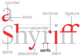
Fonts are either serif (rhymes with sheriff, also known as “Roman”) or sans-serif (rhymes with bans sheriff, also known as “Grotesque” or “Gothic”). A serif is a short line or finishing stroke that crosses or projects from stems or strokes in a character.
A more detailed glossaryExternal link and an introduction to typographyExternal link.
“And that’s still the situation today: in Switzerland there are many small owner-run foundries which create innovative typefaces, but there is no big player, such as Monotype in the United States, whose labels Linotype or FontShop International sell and license typefaces on a global scale.”
Experimentation
One of the “bigger” small Swiss foundries is Lausanne-based Swiss Typefaces, whose 38-year-old co-founder, Ian Party, says the industry is “in excellent health”.
“It was tricky for typeface designers at the beginning of the 2000s when there was an explosion in supply but without an accompanying explosion in demand,” he told swissinfo.ch.
This explosion followed the arrival of the internet and typeface software, which enabled anyone with a computer to generate their own fonts almost overnight.
“We were really at the crossroads when all the graphic designers got a PC. Previously, typefaces were something quite complex and very professional, created by people with specific artistic and technical skills,” Party said.
“Then suddenly everyone became aware that, while not easy, it was possible to develop typefaces quickly and digitalise designs that other people had made. There really was an attitude among graphic designers of creating their own typefaces.”
“During the late 1980s and early 1990s, graphic design projects even questioned the readability of typefaces!” Lzicar added, pointing to a “backlash” against traditional Swiss Style typefaces. “There was a lot more experimentation going on than today.”
Global hit
But you can’t keep a good font down, and after the wild experimental years of the computer revolution – and typefaces only a mother could love – designers eventually returned to the tried-and-tested sans serifs.
In 2004 Laurenz Brunner, a young Swiss graphic designer, published AkkuratExternal link, which went on to be a massive global success for its foundry, Lineto.
Brunner wrote: “In 2006 and 2007 interest grew among designers in an ‘objective’ typographic style which revived many of the classic Swiss design principles. Akkurat thus turned into something of a poster child for this movement.”
Swiss typefaces come in all shapes and sizes and are being used by graphic designers for a wide range of applications, from road signs and posters to bags and magazines:
Lzicar agrees that a large part of Akkurat’s success is that it “adapts the proven principles of its predecessors to the requirements of a global economy”.
He explained: “It doesn’t have limiting characteristics, so graphic designers can use it for many different applications. That made Akkurat one of the global hits of contemporary typeface design in Switzerland.”
Indeed, Akkurat was one of two 21st-century Swiss typefaces (along with SangBleuExternal link, designed by Ian Party in 2008) to make it into The Geometry of Type: The Anatomy of 100 Essential Typefaces (2013, Thames & Hudson).
Akkurat was described as “rooted in the Swiss tradition of pragmatic, rational design”, while SangBleu was seen as a “very sexy type and a worthy replacement for the dated OptimaExternal link”.
Business plan
So if one wants to make money, should one become a typeface designer? “No. Not at all! The work of designing a whole font family is enormous. You should start up a typeface foundry instead – that’s much more lucrative because you are handling the licences,” Lzicar said.
“Choosing the right font is like a DJ choosing the right tune”
“But also in this case, it’s highly unlikely that you’ll have a bestseller like Akkurat. There are so many typefaces [more than 150,000 alone on fonts.com]. It’s really hard to have long-lasting success on the market.”
Ian Party says designers know that sans serifs sell well, “so if you design a typeface similar to Helvetica, to a large degree it’s a business decision”.
“Behind each typeface there’s a business plan. We analyse the market, try to see what sells well, decide what the market needs and how we can make a profit.”
Party, who also teaches type design at ECAL, the University of Art and Design Lausanne, designed the SuisseExternal link font family, which went on to become Swiss Typefaces’ biggest hit. Suisse International is a sans-serif typeface like Helvetica.
“There’s clearly a very close connection between the two,” he admits. “There’s an influence in the sense that we are graphic designers steeped in Swiss culture and that we studied graphic design in Switzerland. Swiss typographic culture includes Helvetica and Univers, which were very present in our education.”
National identity
The Swiss Style of the 1950s and 1960s was known for its attention to detail, precision, skilled training, even neutrality – characteristics that are linked to the national identity. So what do contemporary typefaces say about contemporary society?
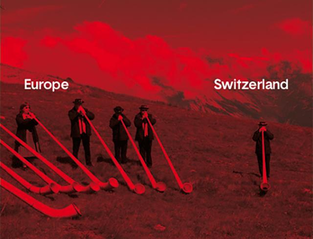
Open Switzerland is a design project, launched in 2013, that brings together iconic Swiss imagery and a custom-made typeface, Basetica. It invites readers to create their own posters and “challenge the notion of a country’s identity”.
The creator of Basetica, Matthieu Cortat, tells swissinfo.ch in an interview (below) about the challenge of re-working Helvetica, how the result reflects 21st-century Switzerland and gives insights into the technical process of creating a font.
More
‘The world is changing – and so is graphic design’
Cortat was born in Delémont in French-speaking Switzerland, but Lzicar doesn’t think there are huge linguistic differences within the country when it comes to designing.
“In contemporary graphic design, ideas are exchanged across political and cultural borders. That is why many typefaces look quite similar. Besides different writing systems, I wouldn’t say there are any regional and national styles any more – it’s an international scene.”
Resolution revolution
Indeed, the trend that has had the greatest effect on contemporary Swiss typography is the ongoing worldwide shift by consumers from paper to screen, increasingly on mobile devices.
“This affects the whole concept of a typeface because on screen you don’t see lines and areas, you see pixels. Now screens are getting smaller but their resolution is increasing. Nevertheless, it’s still different reading something on screen than on paper – for long texts, printed serif typefaces are still my preferred choice,” Lzicar said.
As a result of increasing pixel power, Lzicar hopes there might be a renaissance of the serif. “The medium totally changes how things are perceived.”
This was central to the IKEA fuss over VerdanaExternal link, a sans-serif typeface which was designed to be readable at small sizes and is popular on screen displays but which loses its shape, say critics, when blown up in a magazine or on a poster.
More recently, on September 1 Google introduced a new logoExternal link (using Product SansExternal link, a geometric sans serif), which, it said, reflected the reality that “these days, people interact with Google products across many different platforms, apps and devices”. Initial reaction has been mixed but certainly not as hostile as with IKEA.
Ultimately, Lzicar says choosing the right font is “like a DJ choosing the right tune”: it depends on the context, the mood and the audience.

In compliance with the JTI standards
More: SWI swissinfo.ch certified by the Journalism Trust Initiative




You can find an overview of ongoing debates with our journalists here . Please join us!
If you want to start a conversation about a topic raised in this article or want to report factual errors, email us at english@swissinfo.ch.