100 years of Swiss political posters in colour
Switzerland holds more nationwide referendums than any other country. Even in the age of digitalisation, the traditional political poster is still an important part of every referendum campaign. We look at the past 100 years of political posters.
Under the Swiss direct democracy system, voters get to vote on referendum topics four times a year. In the past century, there have been nationwide consultations on more than 600 issues.
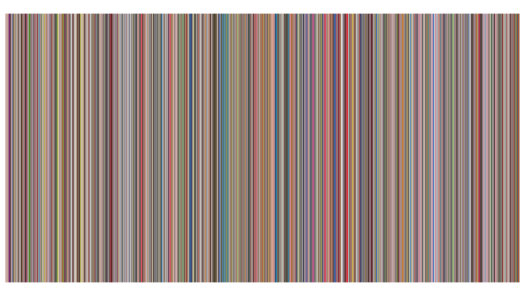
This means that as soon as one campaign is over the next one starts. One of the most important tools of persuasion is the political poster. SwissvotesExternal link, the national database of referendums, is now displaying 680 digitised posters used in the past century. We took a close look at them. One noticeable factor was the use of colour.
Limited palette in 1920s
In earlier days, the colour range in referendum posters was fairly narrow, due to technical limitations. “Early posters are mostly lithographed, and there you had to have a different stone for every colour, which of course cost money,” explains Bettina Richter, curator of the poster collection in the Museum für Gestaltung, the museum of design in Zurich.
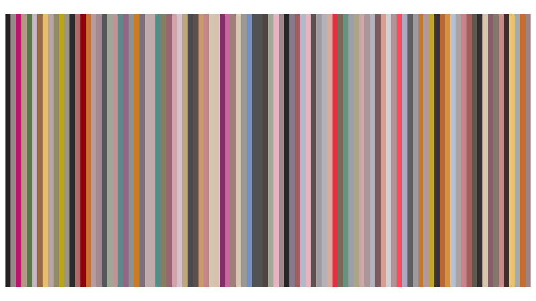
That becomes apparent when we look at the most popular colours at the time. Each strip in the illustration below shows the average colour of a poster, in chronological order from left to right.

“With offset and silkscreen around 1950 new possibilities emerged,” explains Richter. The posters from the last ten years are definitely more varied in colour than those from the first half of the 20th century.
Less colour as a feature of style
Did the restricted palette of referendum posters in the 1920s and 30s – the years of class warfare in Switzerland – lead to colourless referendum campaigning? Not at all. “At that time they used simplistic illustrations and black and white, as it makes a bolder impression, to project alarming messages,” says political scientist Mark Balsiger, who specialises in studying these campaigns. The extremes of the political spectrum, especially the communists and fascists, aimed to be provocative, according to Balsiger.
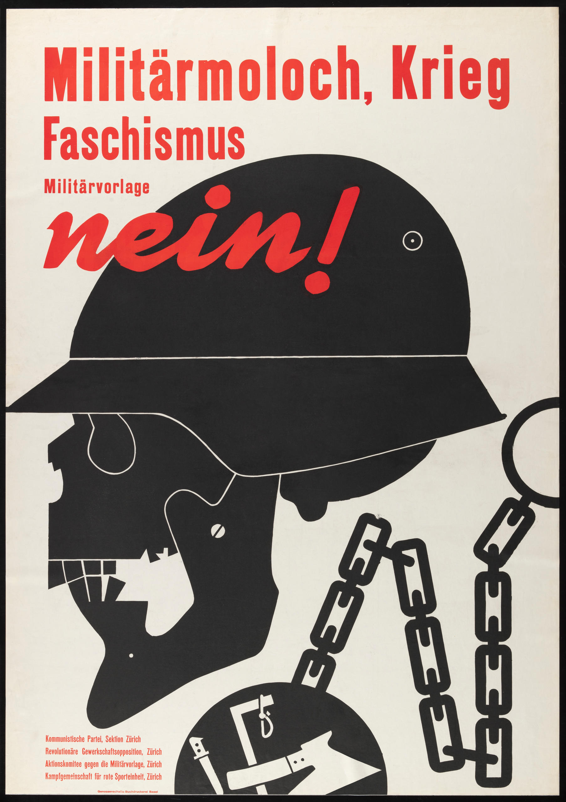
Richter concurs: “The whole rhetoric between parties was more polemic and provocative in tone. The restricted choice as regards colour did not act as a dampener, but actually helped to put forward simple, bold messages.”
Professionalisation in the 1960s
A further reason for the powerful messaging of earlier referendum posters, according to Richter, is the way they were created: “In the 1920s it was still the case that artists worked for political campaigns that they identified with. They got little direction from the campaign organisers, and had great artistic freedom in what they did. So they came up with pictures that packed a punch.”
The rise of advertising agencies in the 1960s changed all that. “The agencies today are just service providers, whatever party is paying the bill,” says Richter. So referendum posters have become less striking and have got to look a lot more like a standard advertisement. “Graphic innovation and ambiguous messages are hardly to be found any more in today’s referendum poster.”
This may be due to the referendum committees themselves, adds Balsiger: “They are quite definite about what they want and they are often broad-based. So the choice of a visual theme often comes down to a compromise.”
1990s brought international attention
In the 1990s, provocative messaging from the conservative right Swiss People’s Party (SVP) became a part of political poster design in referendum campaigns. In Balsiger’s view, the SVP, along with similar parties and organisations, basically revived the rhetoric of the 1930s. “It was more or less ‘back to basics’: provocation, extreme expression, attacking opponents, the kind of thing which had not been seen in the postwar years.”
Richter agrees: “The fact that People’s Party posters are still controversial today, is because their approach is always polemic. Visual themes and rhetoric are used that are more familiar from the early history of the referendum poster, that is the 1920s. The crude caricaturing of opponents and a one-dimensional view that sees everything in black and white is a part of this.”
Along with all this goes a choice of colour like in the 1930s: white, black and red are dominant.

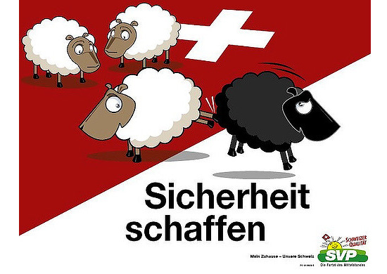
The best-known People’s Party posters are the work of the GOAL advertising agency, led by its owner Alexander Segert. Richter believes the content of referendum posters is more striking when the people behind them are acting out of conviction – designers and agencies that share the outlook of the poster message. “It is apparent from the People’s Party posters that someone is at work here who identifies with the message of the posters. Alexander Segert developed his own visual vocabulary, which with its comics-like style is unusual but quite attractive.”
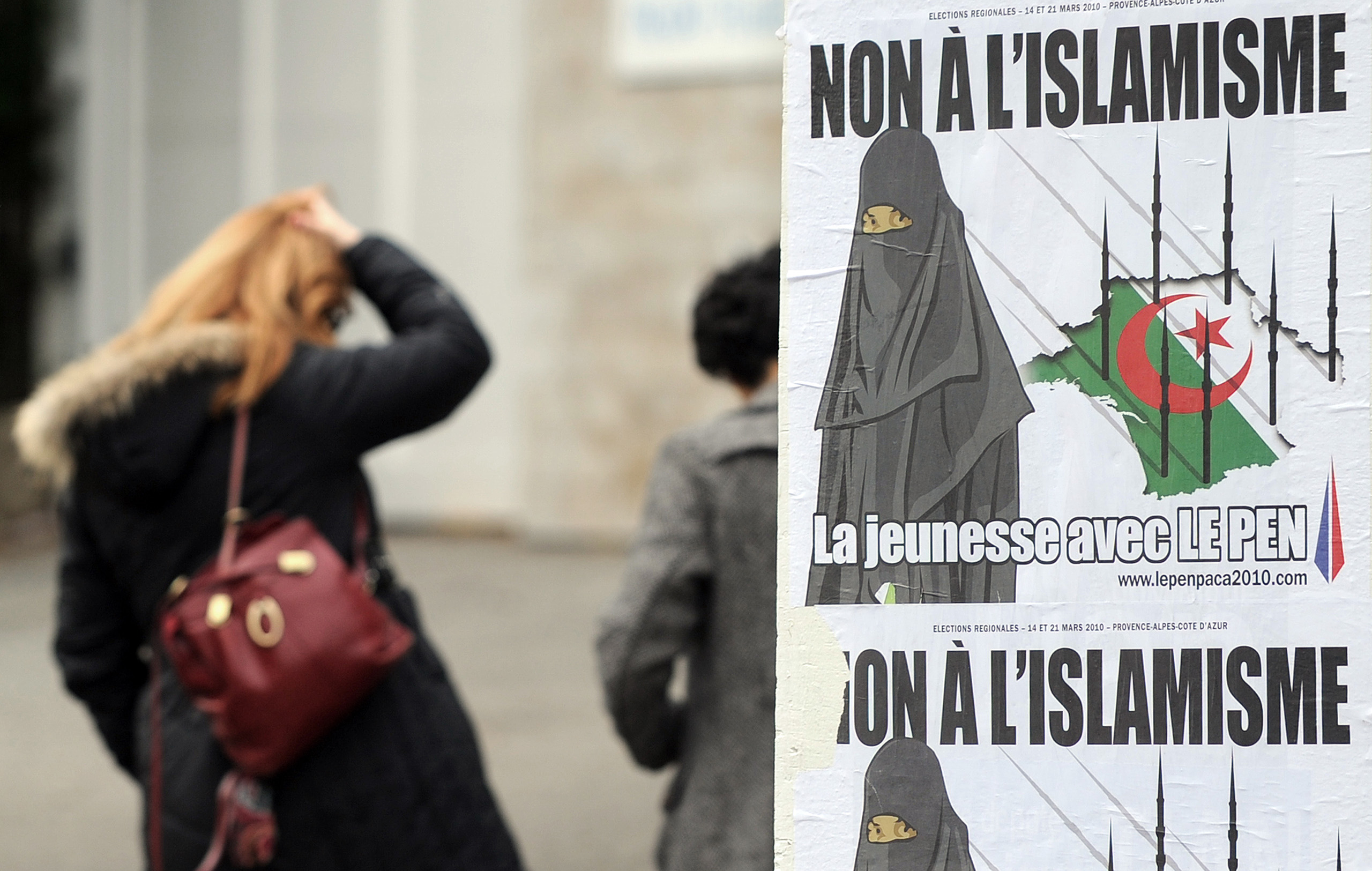
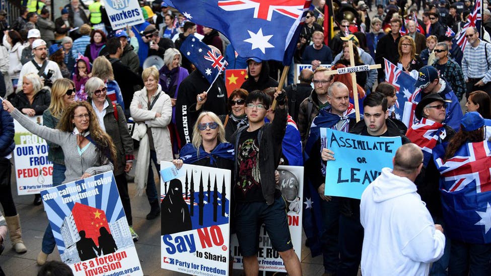
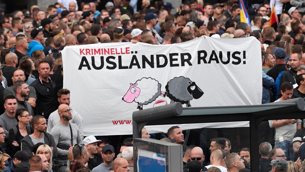
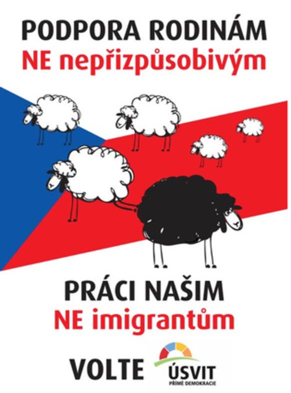
These qualities have aroused attention abroad as well. Motifs from the People’s Party work with GOAL have been copied around the world, for example by the Lega Nord in Italy, but also by extreme right-wing parties in Germany, Belgium and the Czech Republic with which the People’s Party would rather not be associated. The controversial motif used for the initiative to ban minarets in Switzerland – which was approved by the nation’s voters – made it as far as Australia with a time-lag of a few years. There it could be seen at anti-Islamic demonstrations.
People in other countries often regarded the success of the provocative People’s Party posters as a disturbing indication of growing racism in Switzerland. In 2007 the then UN rapporteur on racism and xenophobia directly intervened with the Swiss government to express his dissatisfaction with the People’s Party campaign.
Little resistance from centre and left
More centrist parties, and left-wing parties, did not want to get into this kind of rhetoric and thus had little to offer to counteract the loud poster language of the People’s Party.
Without polemics and provocation, it is not easy to stand out amid all the posters on display. “The message needs to make its point and be understood in a matter of a few seconds. That is a big challenge for the creative teams”, says Mark Balsiger.
Sometimes leftwing groups have managed to be provocative, too.

Richter mentions the Geneva comic-style posters from the 1980s and 1990s. She refers particularly to an artist known as Exem. He did not hesitate to use a kind of rhetoric reminiscent of the People’s Party and worked with clear symbols and portrayals of the enemy. “In the world of referendum posters that is the left-wing equivalent of the People’s Party, just with a more refined, artistically superior and multi-layered quality,” she adds.

In compliance with the JTI standards
More: SWI swissinfo.ch certified by the Journalism Trust Initiative






You can find an overview of ongoing debates with our journalists here . Please join us!
If you want to start a conversation about a topic raised in this article or want to report factual errors, email us at english@swissinfo.ch.