Euclid Flex (designer: Emmanuel Rey; foundry: Swiss Typefaces; release date: 2011)
Euclid Flex, a geometric (made up of circles and straight lines) sans serif, is one of Swiss Typefaces’ best-sellers. Here it is used for a series of exhibition posters for the Museum of Fine Arts of La Chaux-de-Fonds, canton Neuchâtel. Euclid, a Greek mathematician, is known as the father of geometry. (onlab.ch)
onlab.ch
Euclid Flex was initially released as the single-style Euclid BP in 2011 and expanded into a family of five weights with italics a year later. In April 2013 the New York Times Magazine published its annual Food & Drink issue and used most – if not all – of Euclid BP’s permutations. (media.magpile.com)
media.magpile.com
GT Sectra (Dominik Huber, Marc Kappeler, Noël Leu; Grilli Type; 2014)
It was originally designed for the Swiss journalism magazine Reportagen. (grillitype.com/www.moire.ch)
grillitype.com/www.moire.ch
Akkurat (Laurenz Brunner; Lineto; 2004)
Akkurat has similarities with Swiss classic Helvetica, although there are differences. For example, in Akkurat the lower-case 'g' is double-storey (not a circle with a loop under it); the 'l' (lower-case 'L') has a right-facing lower serif or tail; the '4' is open (the vertical line does not join the diagonal line); the top of the '1' is straight (not curved). (etudes-studio.com)
etudes-studio.com
Akkurat
A poster for the B3 Biennale des bewegten Bildes 2013 (Moving Image Biennial) in Frankfurt am Main.
(Nikolas Brückmann, Yuriy Matveev und Klaus Hesse / Institut für neue Kommunikation)
Nikolas Brückmann, Yuriy Matveev und Klaus Hesse / Institut für neue Kommunikation
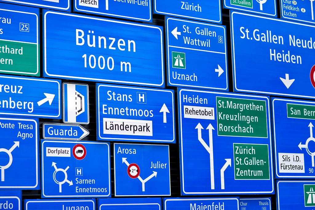
SNV (Schweizer Nationale Verkehrsschrift – Swiss national road sign typeface)
A piste sign at Jakobshorn in Davos taken in 1989. In Switzerland, SNV was replaced on road signs by ASTRA-Frutiger in 2003. (Albert-Jan Pool / http://www.flickr.com)
Albert-Jan Pool
GT Haptik (Reto Moser, Tobias Rechsteiner; Grilli Type; 2010)
A bag for the exhibition Kunstszene Zürich. GT Haptik has a very special characteristic: its uppercase letters and numbers are optimised to be read blindfolded and by touch. Notice the 'R' and the dotted '0'. (buero146.ch)
buero146.ch
Relevant (Michael Mischler, Nik Thoenen; Binneland; 2007)
FAQ (Frequently Asked Questions) reflects on the phenomenon of social networks. The publication, with 50 detachable postcards, looks at the world of virtual meeting and “makes us smile and think about life”. Compare the 'g' with that of Akkurat. The 'a' is also 'single-storey'. (www.faq-projekt.net/hahn-zimmermann.ch)
www.faq-projekt.net/hahn-zimmermann.ch
Simplon Mono (Emmanuel Rey; Swiss Typefaces; 2011)
Some zeroes are plain, some are dotted (see GT Haptik) and some, like Simplon Mono, are slashed. (proxyventures.com)
proxyventures.com
New Paris Skyline (Swiss Typefaces; 2014)
This bag was spotted at the fifth Ruhrtriennale, a three-year cycle of “theatre, music, dance, installations and more” held in former industrial spaces in the Ruhr region of Germany. The typeface is described as “an expressive, curvy and extravagant pick with a high recognition value” (basedesign.com
basedesign.com
Simplon Norm (Emmanuel Rey; Swiss Typefaces, 2011)
Screenprinted posters for Galerie C, a contemporary art gallery in Neuchâtel. (www.onlab.ch)
www.onlab.ch.
Suisse International (Ian Party; Swiss Typefaces; 2011)
The Suisse family comprises Suisse Works (serif), Suisse International (sans serif), Suisse Neue (serif with lighter weights) and Suisse Sign. PLATFORM is a project, situated in a 2,000 square metre floor of a building in a former industrial area in southern Munich, which offers space for cultural production and builds links between culture and business. (http://www.mirkoborsche.com)
http://www.mirkoborsche.com.
If you want to start a conversation about a topic raised in this article or want to report factual errors, email us at english@swissinfo.ch.
Read more
More
Switzerland: still a font of creativity
This content was published on
Sixty years ago Switzerland was the centre of the typographic universe. How are contemporary designers leaving their imprints?
‘The world is changing – and so is graphic design’
This content was published on
What does it mean to be a Swiss font today? Matthieu Cortat explains how he designed Basetica as part of the Open Switzerland project.


You can find an overview of ongoing debates with our journalists here . Please join us!
If you want to start a conversation about a topic raised in this article or want to report factual errors, email us at english@swissinfo.ch.